Abstract Wall Art: How to Understand, Choose, and Display It
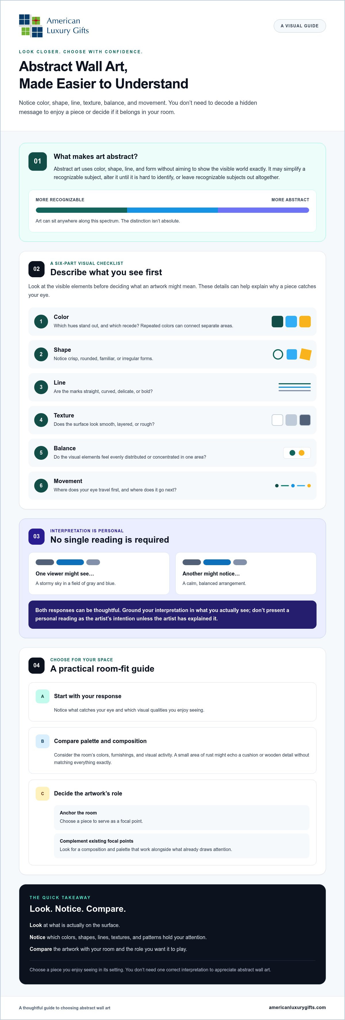
Abstract wall art uses color, shape, line, and form without aiming to depict the visible world exactly. It may simplify a recognizable subject or leave recognizable subjects out altogether. You can appreciate its visual qualities and the response it brings out in you without finding one correct interpretation.
You don’t need to decode a hidden message to know a piece belongs in your home. If you’re unsure what makes a work abstract or how it will suit your room, start by noticing what catches your eye. Then compare its palette and composition with the wall, furnishings, and other focal points nearby.
This guide explains how to look at an artwork’s visual elements, choose a composition and palette for your space, and display a print with intention. The aim is to find a piece you enjoy seeing in its setting.
Key Takeaways
- Abstract wall art can simplify, alter, or leave out recognizable subjects.
- Use color, shape, line, texture, balance, and movement to describe what catches your eye without assigning fixed meanings.
- Compare a print’s palette and composition with your room’s colors and visual activity before choosing.
- Decide whether you want the artwork to anchor the room or complement its existing focal points.
- Match the visual qualities you prefer to the mood and placement you have in mind.
What Is Abstract Wall Art? A Clear Definition for Beginners
Abstract wall art doesn’t aim to show the visible world exactly as it appears. Instead, it uses color, shape, line, and form to create an image or impression. It may simplify a recognizable subject, change it until it’s difficult to identify, or leave recognizable subjects out altogether.
That doesn’t mean a piece has no connection to real life. Flowing blue forms might bring water to mind, while a bold arrangement of shapes could suggest a city, a mood, or a remembered place. The overview of abstract art offers more background, but you don’t need art-history knowledge to appreciate what you see.
For a visual introduction to how composition shapes an abstract work, watch this tutorial:
How Is Abstract Art Different from Representational Art?
Representational art shows recognizable subjects, such as a mountain, a vase, or a person. Abstract art puts more emphasis on the visual elements used to depict or replace those subjects. A representational landscape might show a clear horizon and identifiable trees; an abstract version might use layered greens, uneven lines, and open space to evoke a similar setting. The distinction isn’t absolute. Art can fall anywhere along a spectrum from clearly recognizable to highly abstract.
Does Abstract Art Have to Mean Something Specific?
No. An artist may have a particular starting point or intention, while viewers bring their own memories and associations to the work. You might see a stormy sky in a field of gray and blue; someone else might notice its calm, balanced arrangement. Both are personal responses, not proof of what the artist intended. Unless the artist has explained that intention, don’t present an interpretation as fact. You can simply notice what draws your eye and how the piece feels to you.
How to Read Abstract Wall Art Through Color, Shape, and Movement
Start by describing what you can see, rather than guessing what the artwork is “supposed” to mean. This visual checklist can help you notice how its elements work together. Those details may explain why a piece feels lively, quiet, orderly, or surprising without giving it a fixed message.
- Color: Which hues stand out, and which recede?
- Shape: Do you see crisp, rounded, familiar, or irregular forms?
- Line: Are the marks straight, curved, delicate, or bold?
- Texture: Does the surface look smooth, layered, or rough?
- Balance: Do the visual elements feel evenly distributed or concentrated in one area?
- Movement: Where does your eye travel first, and where does it go next?
This approach aligns with Tate's definition of abstract art, which describes art that does not attempt to represent an accurate depiction of visual reality. Look closely at what’s on the surface before reaching for a story or symbol.
What Can Color and Contrast Communicate?
Color sets a visual tone, but it doesn’t have a guaranteed meaning. A strong contrast between dark and light areas may draw your eye to one part of the composition, while repeated colors can connect separate areas. Notice whether the palette relates to your room’s colors or creates a clear contrast. For example, a small area of rust might echo a cushion or wooden detail without matching everything exactly.
How Do Line, Shape, and Movement Affect the Impression?
Curved lines may guide your attention along a flowing path, while sharp angles can create a more structured rhythm. Repeated shapes can make a composition feel connected; irregular forms may draw attention to variation. These are visual possibilities, not universal emotional rules. Your response may depend on what you notice first and what’s around the artwork.
Imagine a composition with looping blue lines, a bright yellow area, and repeated circles. One viewer might follow the lines and think of moving water; another might focus on the yellow as a lively focal point. Both observations can be thoughtful. Interpretation can be personal and still be thoughtful when it’s grounded in what you actually see. Use close looking to decide which abstract wall art holds your attention and suits the mood you want in a room.
How to Choose Abstract Wall Art That Feels Right for Your Space
Choose abstract wall art by weighing your personal response, the print’s palette and composition, and the wall where you plan to display it. Start with what catches your eye, then consider how the colors and visual activity will sit alongside the room’s furnishings. You don’t need to match a particular decorating style. Look for a piece that feels at home in its intended setting.
If you want a refresher on what abstraction can include, Britannica’s definition of abstract art provides useful context. For choosing a print, your preferences and the room’s needs are the most practical guides.
Which Palette and Composition Suit Your Preferences?
Notice which colors, shapes, and levels of contrast you naturally return to. Do you prefer a limited palette and open space, or layered colors and a composition filled with activity? Neither approach is inherently better. A restrained piece may bring visual quiet to a room, while an energetic arrangement can add a lively focal point.
Before deciding, compare the print with nearby decor. Consider the wall color, furniture, textiles, and objects already drawing attention—whether you are coordinating with curated luxury pieces from Benjamin & Maxwell or everyday accents. The goal isn’t to match every shade. A print that repeats one existing accent color can feel connected to the room, while a contrasting palette can create a deliberate point of interest.
Where Can Abstract Wall Art Work Well?
Abstract art can suit a living room, bedroom, entryway, or home office. Choose a location based on how you’ll see the piece: from across the room, while seated nearby, or in passing. Consider the wall’s role and what surrounds it. A wall near patterned furnishings, shelves, or other decor may pair well with calmer shapes and a more open composition. On a quieter wall, a busier piece might provide the visual focus.
In a living room, assess the artwork in relation to the furniture and your main viewing position instead of choosing it in isolation. If the room already has strong colors and patterns, a less crowded composition may help the space feel balanced. In a simpler setting, you might prefer more contrast or movement. For broader room-specific guidance, explore a guide to choosing living room wall art.
How to Make Abstract Wall Art Feel Intentional in Your Home
Make abstract wall art feel intentional by considering visual balance, nearby colors, and the role you want the artwork to play. A print can act as the room’s focal point or complement other decor. Before choosing a spot, look at what already draws attention and decide whether the art should echo those elements or offer contrast.
Your priority: Create a focal point
Look for: A composition with a clear area of emphasis or noticeable contrast.
Your priority: Keep a visually active room balanced
Look for: A more open composition or colors that relate to existing decor.
Your priority: Make a group of artworks feel connected
Look for: Shared colors, shapes, or a similar visual energy.
Should Abstract Art Stand Alone or Join Other Wall Art?
Let one composition stand alone when you want it to hold attention on a quieter wall or provide a clear focal point. Several works can sit together when there’s room for a group and the pieces share a visual thread. That connection might come from repeated colors, related shapes, or a similar sense of movement. The artworks don’t need to be identical; one shared element can make the arrangement feel considered. If you’re planning a grouping, use a gallery wall guide to explore ways to bring different prints together.
What Should You Check Before Choosing a Print?
Before deciding, confirm that you like the artwork itself, that its colors and composition suit the intended setting, and that the wall gives it the focal or supporting role you have in mind. Consider the view from the places where you’ll spend time, along with nearby furniture, colors, and decor.
American Luxury Gifts includes abstract wall art prints in its broader wall-art catalog. Review the current product page for details and available options. Product information can vary, so check the listing rather than assuming details such as size or framing.
Choose Art That Feels at Home
Abstract wall art doesn’t need a hidden message to belong on your wall. Notice the colors, forms, and movement that hold your attention, then consider how the composition works with the room’s palette and visual activity. A piece can stand on its own as a focal point or connect with other art through shared colors and shapes.
Trust your response, too. You may read a mood or memory into an artwork, while someone else notices its balance or contrast. There’s no need to settle on one interpretation. Choose a print you enjoy seeing in its intended setting, and check the product page for current details before purchasing.
American Luxury Gifts is an American-owned e-commerce business focused on meaningful wall art and gifts, including abstract wall art prints. Use the practical checks in this guide to choose a piece that reflects what you enjoy and suits the room where you plan to display it.
Frequently Asked Questions
How Can You Preview Abstract Art on a Wall Before Choosing It?
Use a paper outline or temporary placement to judge how the artwork relates to nearby furniture and the rest of the wall. Step back to view it from the room entrance and from the place where you’ll usually sit. This can help you see whether the print feels present in the space or gets lost among nearby objects. A preview lets you assess placement without relying on memory alone.
What Should You Compare on Abstract Art Product Pages?
Compare the artwork and the listing details rather than assuming similar-looking prints offer identical options. Check the current product page for available choices and relevant information. Look closely at the full image and its composition, including where the strongest colors and shapes appear. If a detail you need isn’t listed, ask the seller before deciding.
How Can You Tell If an Artwork Will Be Visible from Across a Room?
Look for clear areas of contrast and forms that remain easy to distinguish when you view the image at a smaller scale on your screen. Fine lines and subtle variations may be more noticeable up close, while larger color areas can register more readily from a distance. Consider where you’ll usually see the wall, such as from a doorway or seating area, and choose based on that everyday view.
Can Abstract Art Suit a Small Room?
Yes. Consider how much visual attention the artwork will add alongside furniture, shelves, and other decor. A composition with open space may feel less crowded than one with many overlapping shapes, though your preference matters most. Look at the wall as part of the whole room, not in isolation. Choose a piece that feels at ease in the available setting.
How Do You Coordinate Several Abstract Prints Without Making Them Match?
Choose one or two shared visual features to connect the prints, then let other qualities differ. For instance, a group might share a muted palette while varying in shape and composition. You can also connect pieces through similar line quality or a comparable level of visual energy. View the artworks together before arranging them to check whether they feel related without looking like duplicates.
Is Abstract Wall Art a Good Gift If You’re Unsure of Someone’s Taste?
It can be, but use what you know about the recipient to guide the choice. Notice the colors they use at home, the art they already display, and whether they tend to prefer quieter or more expressive decor. If you’re still uncertain, check the product page for current details and choose a print suited to a room or palette you know well. A thoughtful choice reflects their preferences, not just yours.


